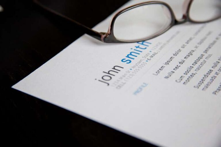
In my last post I wrote, “Design is more than prettying up your resume. It’s about how you group and present information. It’s about organization, hierarchy, and editing as well.” I will mention that there are templates you can find but just because they exist out there doesn’t mean they are good, you need some skill to even select a template. So, let’s talk about some general design facts that you want to display in your resume.
- Keep it Professional Sometimes I have seen resumes that are cutesy or fun looking. Think about your audience (school administrators) and design for your audience. You are a professional presenting yourself to another professional so make your resume, above all things, professional. This is not the time for clip art or patterns. Also, skip infographics
- Font Advice Two fonts should suffice. Select fonts that are readable and professional in print and digital form. You can use different sizes, weights, and even colors to create a hierarchy. Your job titles, for example, should stand out a little. Sometimes there is the urge to squeeze content but resist the urge to make your fonts too small in an attempt to fit everything. Also, make sure your two font choices pair well together. Check out Google’s collection of free fonts and search for good font pairings if you don’t feel confident selecting.
- Color Advice Keep color minimal or stick to black and white. Color can be used on your name and job titles, but don’t go crazy with color. I have seen resumes over-designed on many occasions. Never apply color to backgrounds. Very often your resume will be printed and often on a black and white copier. So, if you use some color, see how it prints out ion a copier to see that it can stand up to the conversion.
- Create a Structure Use columns and align text. Designers tend to think in terms of columns/grids. You might divide your resume into 3-4 columns. A header might cross over all columns while your experience section may only cross over columns 3 of the 4 columns with the last column used for other content.
- Sort You Information Once you know what is going into your resume you can think about how to bundle it. For example, you might have a section that highlights your technical skills and another for your art media skills. If education is your second career you may have an education work experience at the top and other experience condensed.
- Brand Yourself Whatever color, logo, font, etc you use, carry that over to your cover letter, your physical portfolio, and even your online material.
I’m attaching my own resume for your reference. Happy designing!
Author Maureen Meyer spent over twenty years in art education as both an art teacher and department chair. Maureen is also a graphic designer and founder of My Art Lesson. Maureen is available for resume consulting and designing. Contact her at info@myartlesson


