Grade Level
9-10, 11-12Duration
10 classes, 45 minutes
Materials
Access to a program like Illustrator. Alternatives include online program Vectr, or downloadable Inkscape.
Media
Digital
Lesson Objectives
The student will…
Create a portrait or figure out of text.
Be exposed to and explore a wide range of text choices
Understand how to work with text in a vector program, to manipulate text and converting fonts to vector art (especially if working on different computers).
To think of fonts both literally (what do I literally want my text to say) and/or expressively (as value, or as a shape).
Introductory Activity
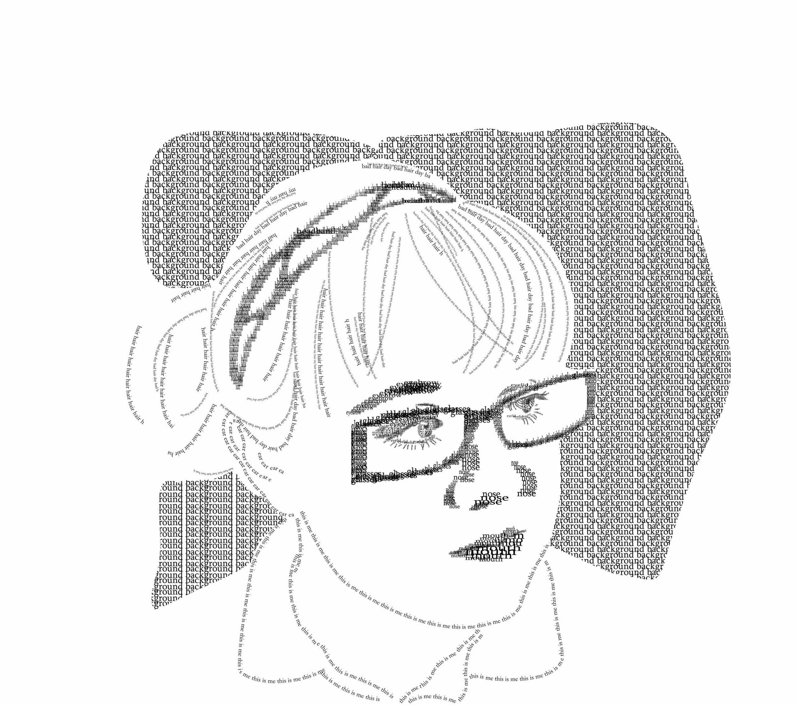
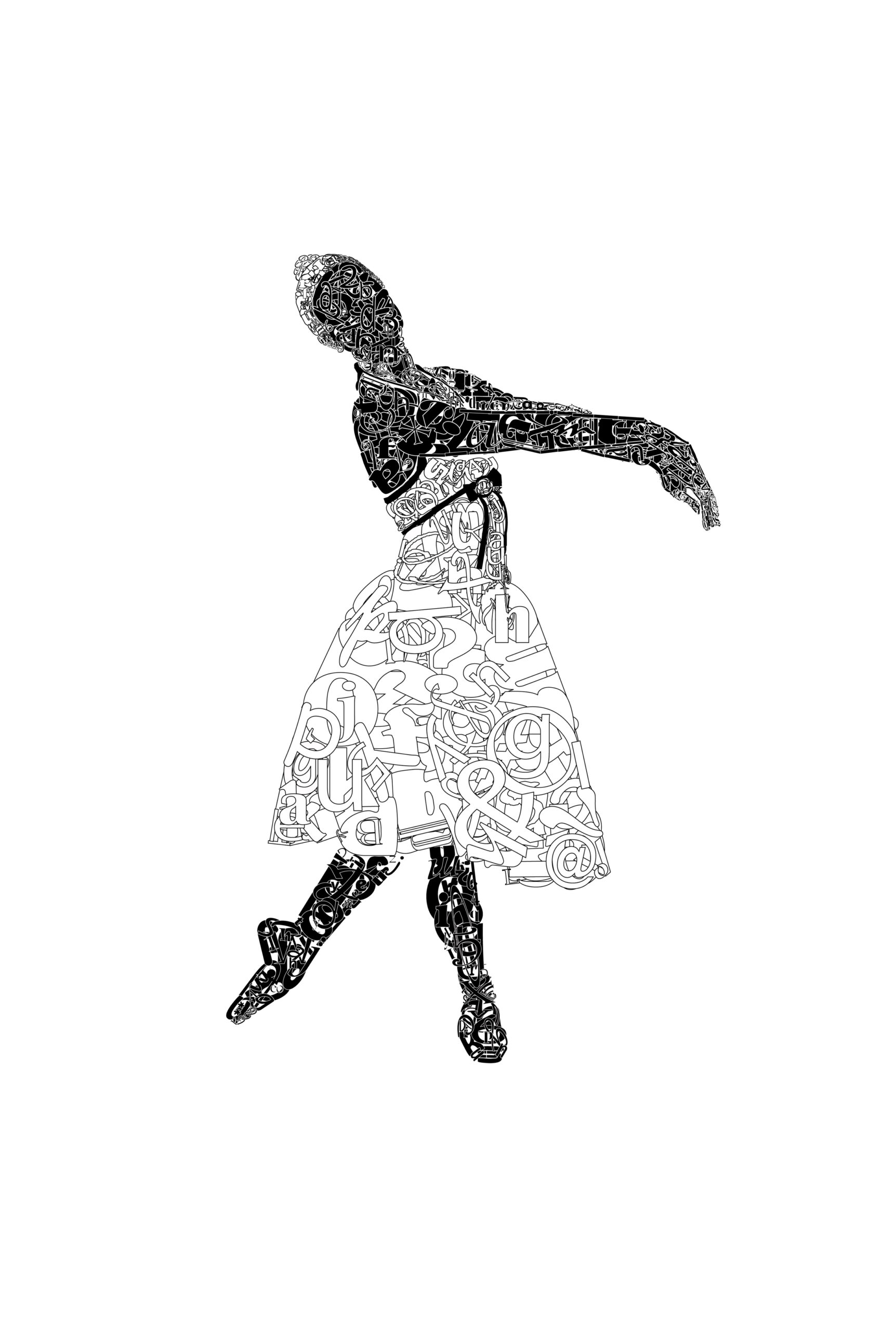
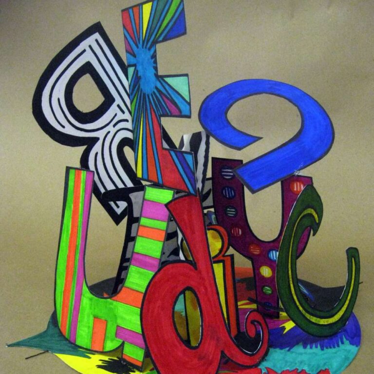
I teach this as a very early lesson when learning Vector art in a Graphic Design/Digital Art Class. Students are taught how to enter text at a point versus entering text in an area. Most students have some experience with programs that use text boxes so I have to be sure to both draw on that experience as well as move beyond those habits it has created. We talk about the design and anatomy of a font and the different looks and usages that result. Students are taught how to place type in boxes and other shapes as well as on a path and how to alter size, weight, direction, and color. In the way I teach the lesson, we don’t distort type. Type is created by artists and we try to respect and celebrate the type.
We cover fonts being native to a computer and what will happen when moving computers with different font choices and some work arounds for that. Generally, every computer is going to have a different selection of fonts available and if they move computers, the program will attempt to open those fonts and when they can’t will typically substitute them, which will change the look of the programs. We talk about converting the text to vector outlines. The downside is they can no longer edit the text directly, say by changing font weight. Usually this has been found to be the preferred way to go.
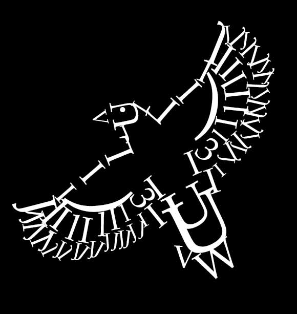
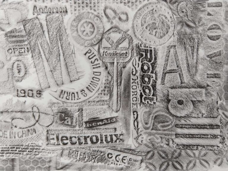
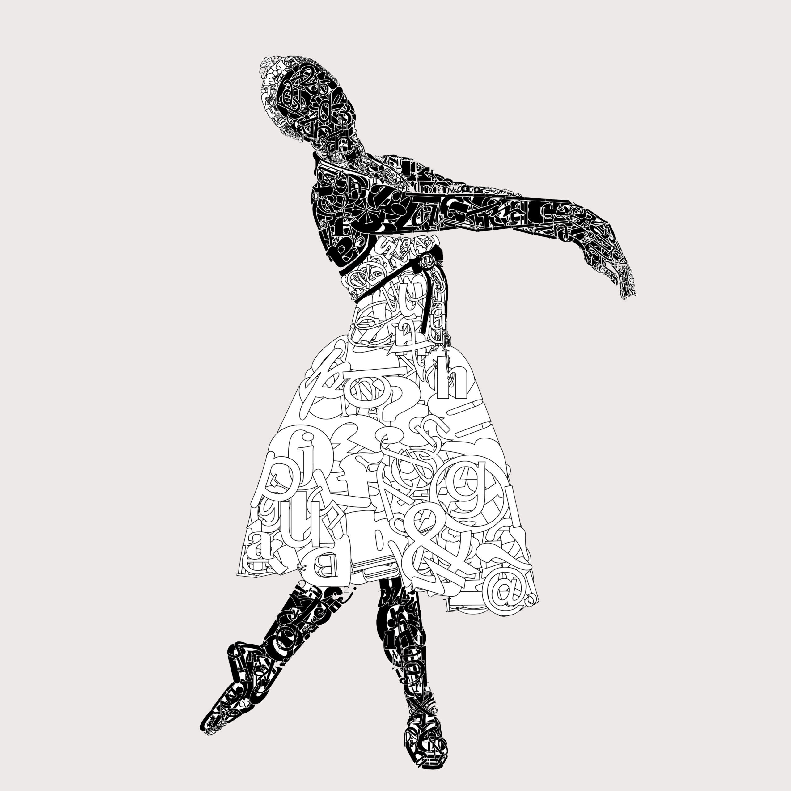
We look at the vast array of portraits and figures created by text that exists on the internet.
I will mention, there are so many variations on this assignment and takes on it. I have seen celebrities done, historical figures with their own words used, I’ve done self portraits, etc. Have fun and give students some creative room to see what they develop.
Lesson Process
in this example, I had students find an image of themselves to work from to show something about themselves. Students placed and locked the photo in place and then began building the text figure or portrait by laying the type on top of the image. i encourage students to turn the photograph layer on and off to see how the figure or portrait is coming along. When working with figures students should think about how round letters (like an o, a, etc) might suggest a joint. I encourage students to also thing about numbers and punctuations as well as letters.
Vocabulary
x-height, san serif, ascender, descender, font, Type, weight. serif, cap height. stokeResources
Type Anatomy: A Visual Guide to the Parts of Letters
P-O-R-T-R-A-I-T: The Artist Who Draws With Letters – The Atlantic
Author & Website/Blog
Supporting Images