Duration
7 periods, 45 minutes in length
Materials
Oil pastels (I use Crayola), Varied color construction paper (I like fadeless), OR varied colors of pastel paper. Working larger on larger sizes helps students work with looser and more active marks, I feel.
Fruit (fake or real), spotlight
*Chalk pastels can be used, but I prefer oils because there is less shedding of material and mess
Media
Oil pastels
Lesson Objectives
For the student to:
Apply an understanding of color, color theory, and various color compositions to a series of drawings of fruit.
Demonstrate an understanding of form and how to describe form through mark making and shadows, highlights, and cast shadows.
Introductory Activity
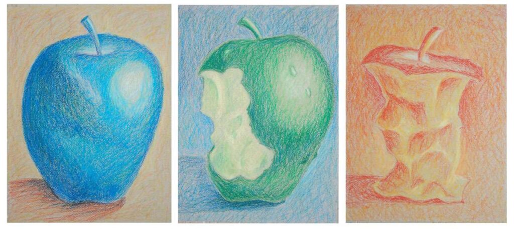
We go over a basic color wheel in students’ sketchbooks. Then, students are introduced to different color compositions, including monochromatic, complementary, and analogous.
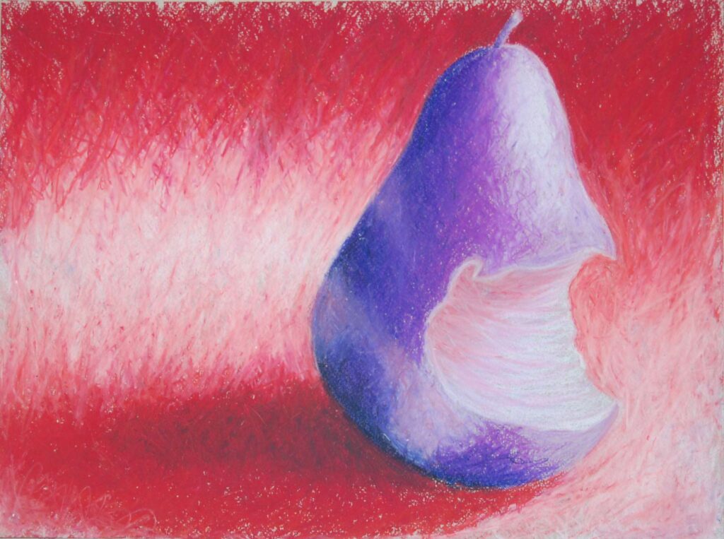
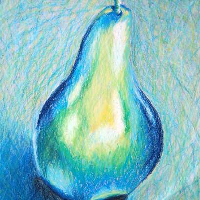
We spend a couple of days practicing. Sometimes, we work in pencil with the concept of form and value through “active” mark-making. Sometimes, we work on how to do that with oil pastels. I teach them to use a variety of hues (if you are working with blue, use all the possible expressions of blue. If you are using green, use all the oil pastels that express greens and even blues and yellows you mix. I teach them to avoid black for the most part and instead to use dark colors and compliments to darken a color (this is not everyone’s preference, but I do use this impressionistic approach with my students because it challenges what they know, assumes, and what is instinctual). I also encourage students not to blend the oils through smudging actively (colors get muddy) but to allow marks to overlap and build up. It’s fine to let the toned paper show through a little; it’s one reason to use colored paper.
Lesson Process
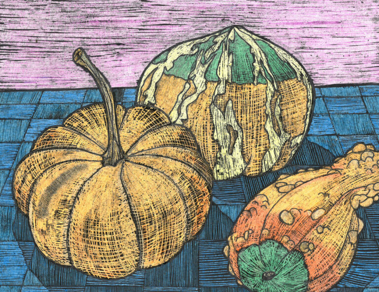
We have a variety of fruit of differing colors (red apples, green apples, oranges, peaches, green pears, yellow pairs, red pairs, etc). Students do not have to use the actual color of the fruit as a base but can do so if they want. Sometimes, we talk about how we might feel looking at an orange if it wasn’t an orange!
Students are expected to do three drawings in total: one monochromatic, one analogous, and one complimentary. They have some loose interpretations of these color schemes. They can use 2-4 colors in an analogous color scheme (Red and orange OR red, orange, yellow, for example. For complimentary students, they can also use sets of compliments. They can also use one color in the fruit and one in the background or mix them more. Regardless, we limit black and use dark colors to create the shadow of the fruit.
* for some odd reason, students will create a ground of, say, blue, and the fruits cast shadow will suddenly jump to another color for the cast shadow. I don’t know why kids do this, but they do. I reviewed and demonstrated that the cast shadow should be dark blue if the ground is blue. Yes, it can have other colors to deepen and darken, but it should look like the same surface.
Vocabulary
highlight, shadow, form, monochromatic, color, color wheel, analogous, complimentaryResources
10 Oil Pastel Techniques – YouTube
Author & Website/Blog
Supporting Images
